pacman::p_load(ggiraph, tidyverse) In Class Exercise 3
Installing and Loading R Packages
Two packages will be installed and loaded. They are: tidyverse and ggiraph
Importing Data
exam_data <- read_csv("data/Exam_data.csv")Exploring Interactive Tooltip Effect
p <- ggplot(data=exam_data,
       aes(x = MATHS)) +
  geom_dotplot_interactive(
    aes(tooltip = ID),
    stackgroups = TRUE,
    binwidth = 1,
    method = "histodot") +
  scale_y_continuous(NULL,
                     breaks = NULL)
girafe(
  ggobj = p,
  width_svg = 6,
  height_svg = 6*0.618
)
Displaying Multiple Information on Tooltip
exam_data$tooltip <- c(paste0(     #<<
  "Name = ", exam_data$ID,         #<<
  "\n Class = ", exam_data$CLASS)) #<<

p <- ggplot(data=exam_data,
       aes(x = MATHS)) +
  geom_dotplot_interactive(
    aes(tooltip = exam_data$tooltip), #<<
    stackgroups = TRUE,
    binwidth = 1,
    method = "histodot") +
  scale_y_continuous(NULL,
                     breaks = NULL)
girafe(
  ggobj = p,
  width_svg = 8,
  height_svg = 8*0.618
)
Customizing / Formatting Tooltip Styles
tooltip_css <- "background-color:white; #<<
font-style:bold; color:black;" #<<

p <- ggplot(data=exam_data,
       aes(x = MATHS)) +
  geom_dotplot_interactive(
    aes(tooltip = ID),
    stackgroups = TRUE,
    binwidth = 1,
    method = "histodot") +
  scale_y_continuous(NULL,
                     breaks = NULL)
girafe(
  ggobj = p,
  width_svg = 6,
  height_svg = 6*0.618,
  options = list(    #<<
    opts_tooltip(    #<<
      css = tooltip_css)) #<<
)
Displaying statistics on tooltip
tooltip <- function(y, ymax, accuracy = .01) {   #<<
  mean <- scales::number(y, accuracy = accuracy) #<<
  sem <- scales::number(ymax - y, accuracy = accuracy) #<<
  paste("Mean maths scores:", mean, "+/-", sem) #<<
} #<<

gg_point <- ggplot(data=exam_data,
                   aes(x = RACE),
) +
  stat_summary(aes(y = MATHS,
                   tooltip = after_stat(  #<<
                     tooltip(y, ymax))),  #<<
    fun.data = "mean_se",
    geom = GeomInteractiveCol,  #<<
    fill = "light blue"
  ) +
  stat_summary(aes(y = MATHS),
    fun.data = mean_se,
    geom = "errorbar", width = 0.2, size = 0.2
  )

girafe(ggobj = gg_point,
       width_svg = 8,
       height_svg = 8*0.618)
Hover Effect - Using another attribute as an aesthetic
p <- ggplot(data=exam_data,
       aes(x = MATHS)) +
  geom_dotplot_interactive(
    aes(data_id = CLASS),
    stackgroups = TRUE,
    binwidth = 1,
    method = "histodot") +
  scale_y_continuous(NULL,
                     breaks = NULL)
girafe(
  ggobj = p,
  width_svg = 6,
  height_svg = 6*0.618,
  options = list(                        #<<
    opts_hover(css = "fill: #202020;"),  #<<
    opts_hover_inv(css = "opacity:0.2;") #<<
  )                                      #<<
)
Combining tooltip and hover effect
p <- ggplot(data=exam_data,
       aes(x = MATHS)) +
  geom_dotplot_interactive(
    aes(tooltip = CLASS, #<<
        data_id = CLASS),#<<
    stackgroups = TRUE,
    binwidth = 1,
    method = "histodot") +
  scale_y_continuous(NULL,
                     breaks = NULL)
girafe(
  ggobj = p,
  width_svg = 6,
  height_svg = 6*0.618,
  options = list(
    opts_hover(css = "fill: #202020;"),
    opts_hover_inv(css = "opacity:0.2;")
  )
) Coordinated Views between 2 plots #QUESTION ON PLOT SIZE
p1 <- ggplot(data=exam_data,
       aes(x = MATHS)) +
  geom_dotplot_interactive(
    aes(data_id = ID),
    stackgroups = TRUE,
    binwidth = 1,
    method = "histodot") +
  coord_cartesian(xlim=c(0,100)) + #<<
  scale_y_continuous(NULL,
                     breaks = NULL)

p2 <- ggplot(data=exam_data,
       aes(x = ENGLISH)) +
  geom_dotplot_interactive(
    aes(data_id = ID),
    stackgroups = TRUE,
    binwidth = 1,
    method = "histodot") +
  coord_cartesian(xlim=c(0,100)) + #<<
  scale_y_continuous(NULL,
                     breaks = NULL)

#girafe(code = print(p1 / p2), #<<
#       width_svg = 8,
#       height_svg = 8
#        )
Interactive Data Table
DT::datatable(exam_data, class= "compact")Interactive Data Table with Plot
pacman::p_load(plotly) #<< Package Load

d <- highlight_key(exam_data)
p <- ggplot(d,
            aes(ENGLISH,
                MATHS)) +
  geom_point(size=1) +
  coord_cartesian(xlim=c(0,100),
                  ylim=c(0,100))

gg <- highlight(ggplotly(p),
                "plotly_selected")

crosstalk::bscols(gg,
                  DT::datatable(d),
                  widths = 5)
Animated Plots
pacman::p_load(readxl, gganimate, gifski, gapminder) #<< Package Load

###<< Data Import / Data Conversion

col <- c("Country", "Continent")
globalPop <- read_xls("data/GlobalPopulation.xls",
                      sheet="Data") %>%
  mutate_each_(funs(factor(.)), col) %>%
  mutate(Year = as.integer(Year))

###<< Build Animated Bubble Plot

ggplot(globalPop, aes(x = Old, y = Young,
                      size = Population,
                      colour = Country)) +
  geom_point(alpha = 0.7,
             show.legend = FALSE) +
  scale_colour_manual(values = country_colors) +
  scale_size(range = c(2, 12)) +
  labs(title = 'Year: {frame_time}',
       x = '% Aged',
       y = '% Young') +
  transition_time(Year) +       #<<
  ease_aes('linear')            #<<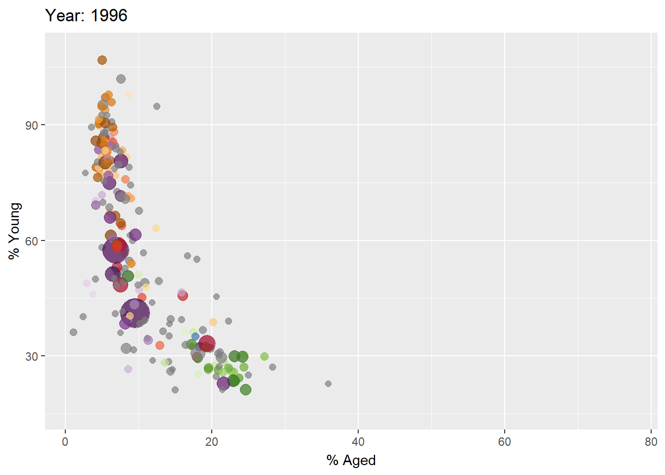
Visualizing Large Datasets #How does the Packed Bar Method WOrk?
pacman::p_load(readr, rPackedBar) #<< Package Load

#<< Import Data
GDP <- read_csv("data/GDP.csv")
WorldCountry <- read_csv("data/WorldCountry.csv")

#<< Data Prep
GDP_selected <- GDP %>%
  mutate(Values = as.numeric(`2020`)) %>%
  select(1:3, Values) %>%
  pivot_wider(names_from = `Series Name`,
              values_from = `Values`) %>%
  left_join(y=WorldCountry, by = c("Country Code" = "ISO-alpha3 Code"))

GDP_selected <- GDP %>%
  mutate(GDP = as.numeric(`2020`)) %>%
  filter(`Series Name` == "GDP (current US$)") %>%
  select(1:2, GDP) %>%
  na.omit()

p = plotly_packed_bar(
  input_data = GDP_selected,
  label_column = "Country Name",
  value_column = "GDP",
  number_rows = 10,
  plot_title = "Top 10 countries by GDP, 2020",
  xaxis_label = "GDP (US$)",
  hover_label = "GDP",
  min_label_width = 0.018,
  color_bar_color = "#00aced",
  label_color = "white")
plotly::config(p, displayModeBar = FALSE)